Local SEO Search
How to Recover a Suspended Google Business Profile?
Google Business Profile (GBP) listings are a cornerstone for businesses aiming to establish a solid online presence, especially for local SEO. A GBP listing boosts...
The astonishingly rapid pace of the internet’s evolution has bred many recent changes in the way we interact with online websites, one of which is how we view mobile content vs desktop content.
Because of this, companies must consider the question, “Should mobile content be different from desktop content?”
And to this, the short answer is no, and here’s why.
Difference between mobile content and desktop content
If you’re any bit proud of your current website, you probably want visitors on mobile have a similar experience to those that drop by your desktop site, right? Then this is good news for you, because mobile content should be the exact stuff as what you already have on your desktop, with a few display tweaks. As long as you have written your on-site content with the visitor in mind, all you need to keep in mind with your mobile site are a few design pointers.
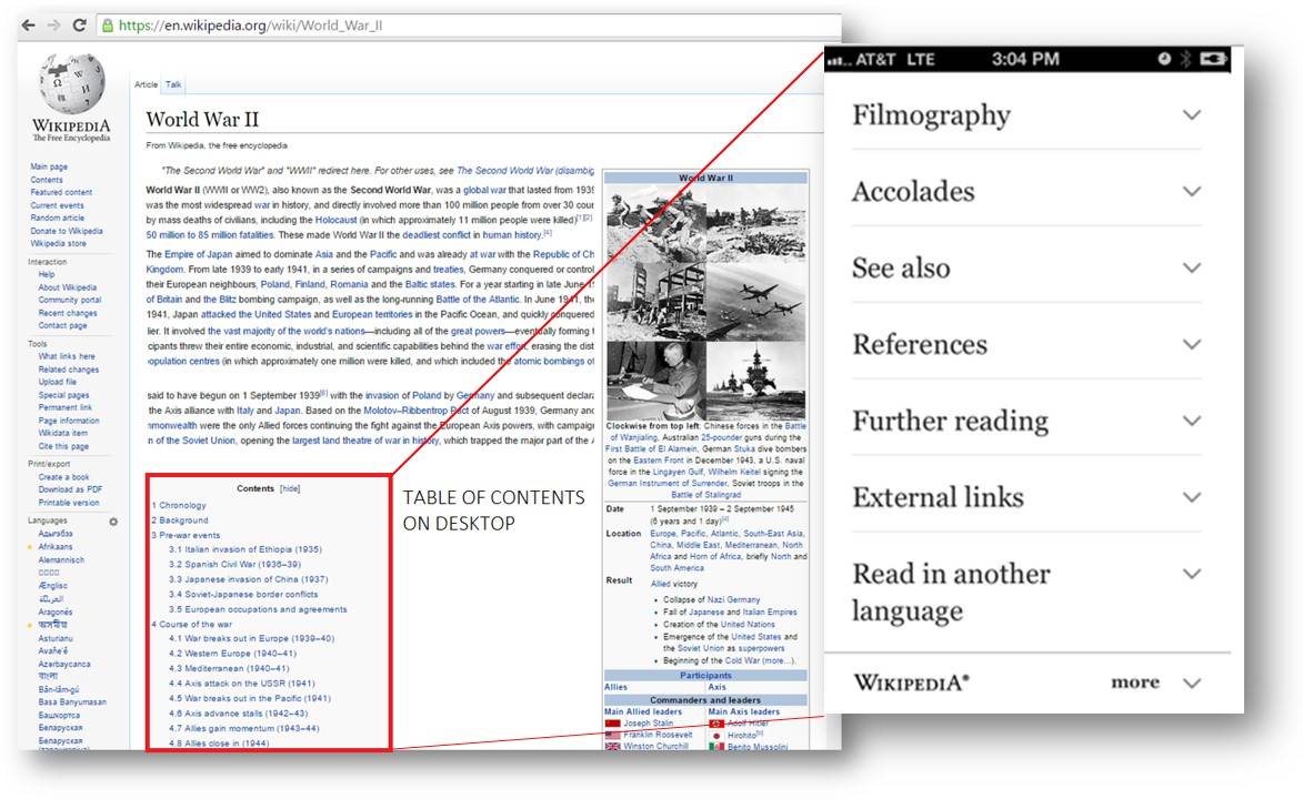
Here is a classic example of how to structure your content for mobile viewing that Wikipedia makes perfect use of:
Here, Wikipedia has utilized a mobile website design tool that automatically sorts all page content into a tabbed form so that the viewer can look at exactly what they want first rather than spending hours scrolling down a page 10,000 words.
Although desktop scrolling is incredibly easy, this kind of mobile design that uses tabbed content is actually in some ways better than the traditional desktop version of things in that your eyes don’t need to search out twenty different things to find what you want as it is arranged into a clear list to conserve maximum viewing time.
But what you’re probably thinking is “well my content isn’t arranged or planned out like Wikipedia so this can’t apply to me” and you’re half right in thinking this.
Breaking up content can still be done on all kinds of web pages, as long as there are some kind of headers to break up thoughts. Doing this will allow the viewer to access what they want first like a mobile user pressing on a tab that contains content pertaining to “key benefits” rather than having to wade through a lengthy product description that is listed above that they don’t care about.
It is true that writing lengthy product descriptions or informative website information can boost SEO value as it is shown that longer pieces do tend to get indexed on Google higher.
It is usually a good idea to have a paragraph or two before you begin showing the mobile content that is tabbed for viewing beneath, however many would recommend that more than a paragraph or two should be shown.
With specialization in Google Ads, Facebook Ads, Bing Ads, Amazon, LinkedIn and more, we have got you covered from Keywords Selection to Conversion Tracking & Reporting.
This is because content that is hidden in a tab is devalued by search engines like Google. But you know you for sure don’t want to have a text overload on your pages otherwise your bounce rate will skyrocket, so you need to find that beautiful middle ground of what is important enough to show above the tabbed content.
This is where mobile design consultation can be a useful tool if you’re not sure how to choose where to show what elements of your website.
As mentioned previously, creating tabs on different product or service information is a standard practice in mobile design and can be used to hold topics like the features and benefits, along with images.
Along with this school of thought that dictates the “balance of SEO and user experience” we need to remember that this is what we should be doing for both desktops and mobile devices. When it comes to mobile website design, displaying content efficiently is a high priority for companies for a reason.
Finding some help with your website’s mobile design doesn’t have to be a hassle.
Tell us what your problem is and we can solve it together.
Image credit: https://pixabay.com/en/office-freelancer-computer-business-612532/
Google Business Profile (GBP) listings are a cornerstone for businesses aiming to establish a solid online presence, especially for local SEO. A GBP listing boosts...
The digital marketing landscape is a powerful force, shaping how we perceive brands and interact with the world around us. But for far too long,...
In the sophisticated landscape of Search Engine Optimization (SEO), backlinks are recognized as endorsements from one website to another, signifying to search engines the content’s...
The world of SEO is constantly evolving, and Google’s March 2024 Core Update is no exception. With every algorithm change, the search engine landscape shifts,...
Eric Enge, President of Pilot Holding, stands as a distinguished thought leader in the realm of SEO (Search Engine Optimization), boasting over two decades of...
In the fiercely competitive landscape of SaaS, every single conversion counts. But with so many variables at play, optimizing your conversion funnel can feel like...